Capital Metro
Nearly a decade of managing all public-facing UX for the regional transit authority in Austin, TX.
Overview
For eight and a half years, I was webmaster and UX researcher/designer for CapMetro. My primary responsibility was UX design and research for the website, CapMetro.org. However, I also handled UX research and design for every public-facing digital touchpoint for the agency. For the last five years of my engagement, I managed a small team with designers and developers working under my guidance.
I was responsible for the design and development of several iterations of CapMetro.org over my tenure, but the most recent design is still in use years after my departure.
Below are a few documentation examples and screenshots of my work. I would be happy to show you the original documents for any of these and discuss the project in detail.
Results
- Steady 12-15% YTY increase in user base
- Radical transformation of CapMetro.org, including innovations in responsive design and usability, supported by award-winning accessibility·
- UX research and UI design for diverse technologies, including a new CapMetro mobile app, systemic QR codes, and interactive kiosks
- Years of sustained user research comprehensively documented and still in use
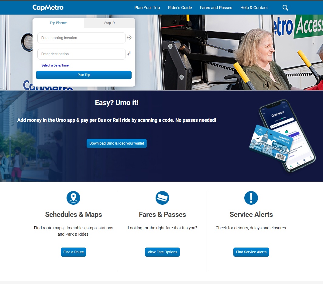
Capmetro.org still uses my UX design as of April 2025
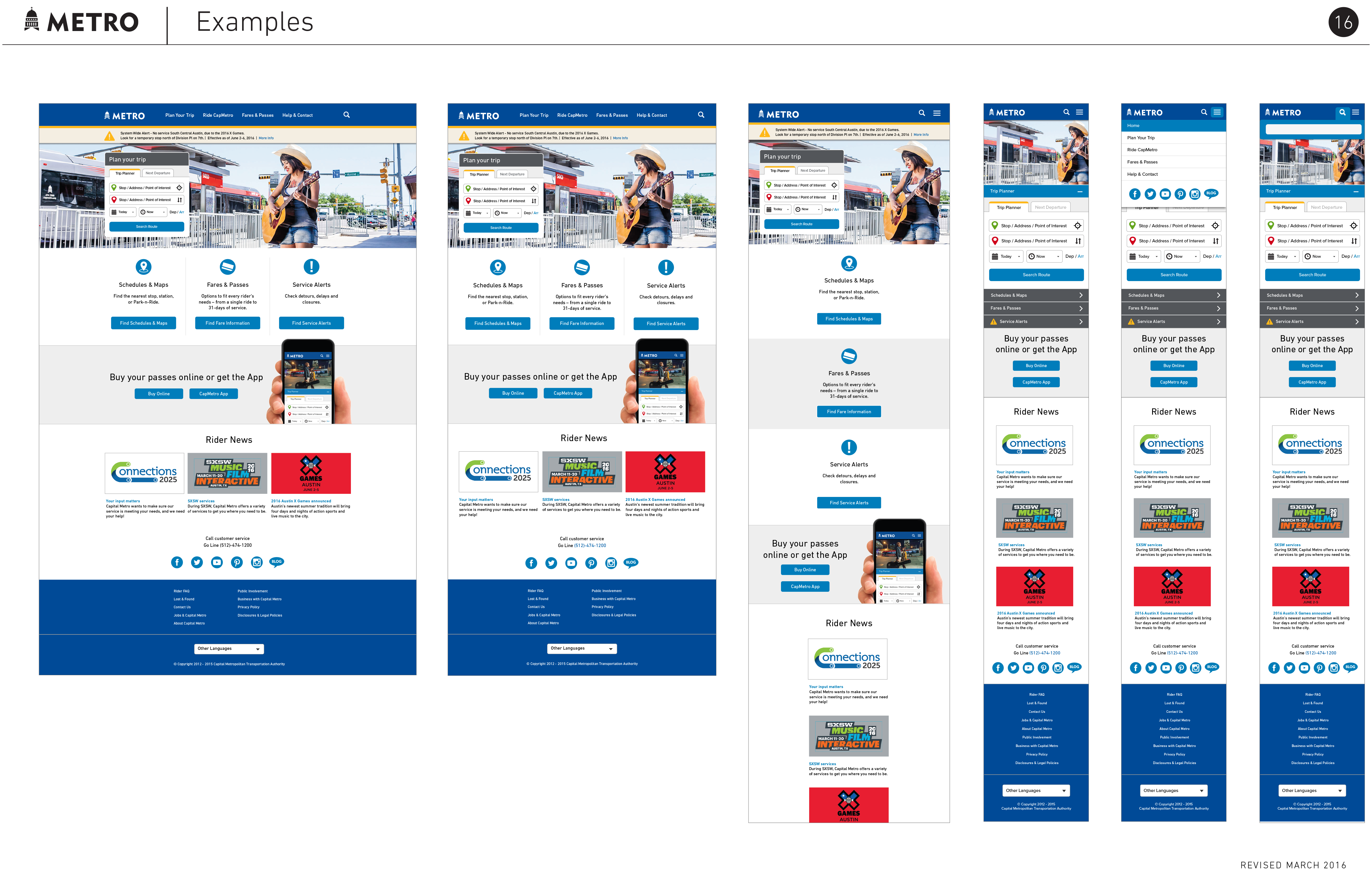
These are examples of scrolling the responsive page mockups for the home page. The page hierarchy and information architecture are derived from extensive user testing and user needs analysis. The entire site was also tested with blind and low-visibility users to ensure utility and ease of use with assistive technology. Combined with a minimalist design aesthetic and UX best practices that are still taught as standards, the site has endured the test of time.
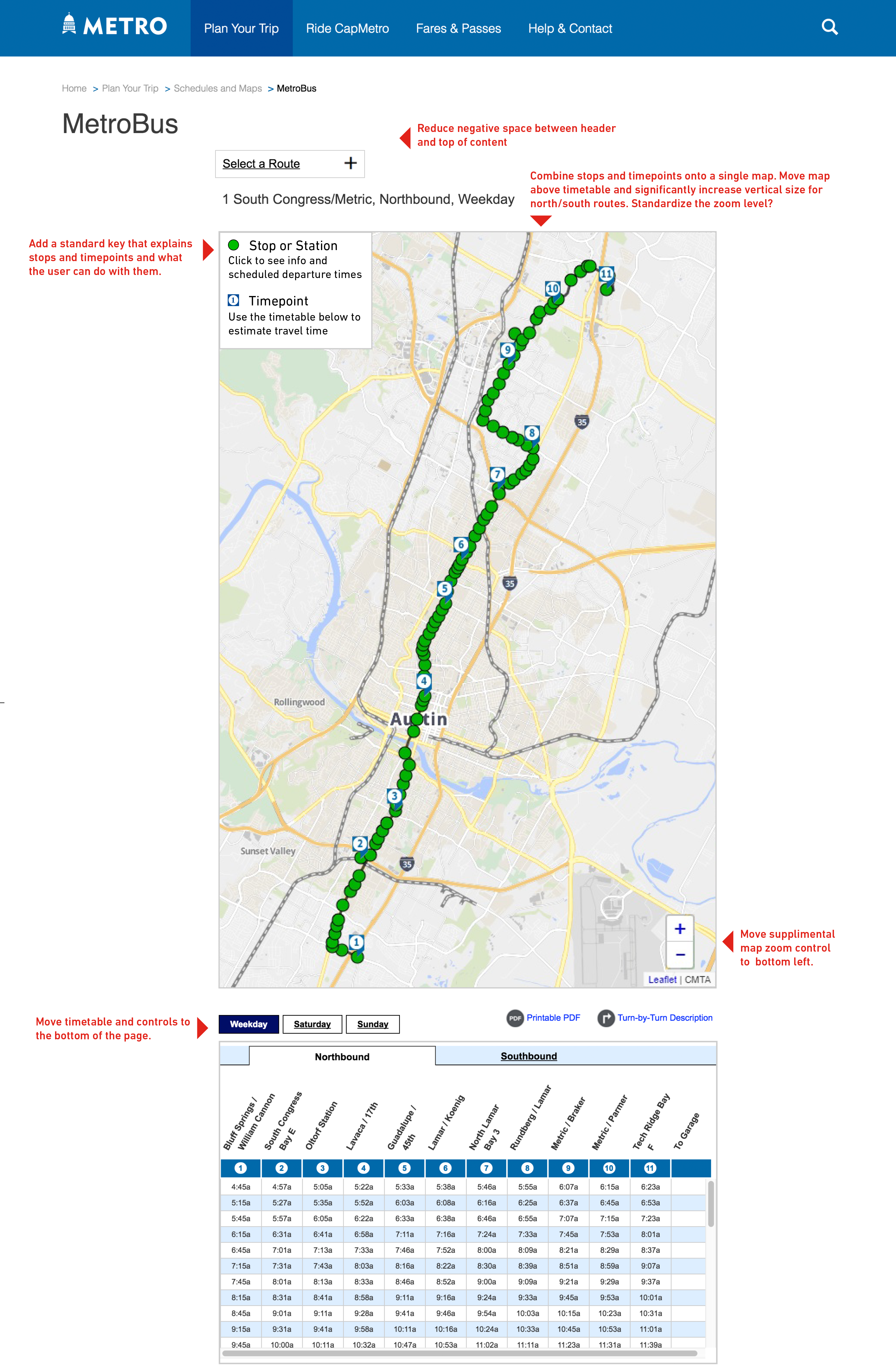
This is a mockup for the notoriously complex online bus route maps. It represents one of several versions created through extensive user testing and refinement of the route interface. At this point in my role at CapMetro, I am providing annotations to guide my design and development team, which includes both my direct reports and members from other departments.
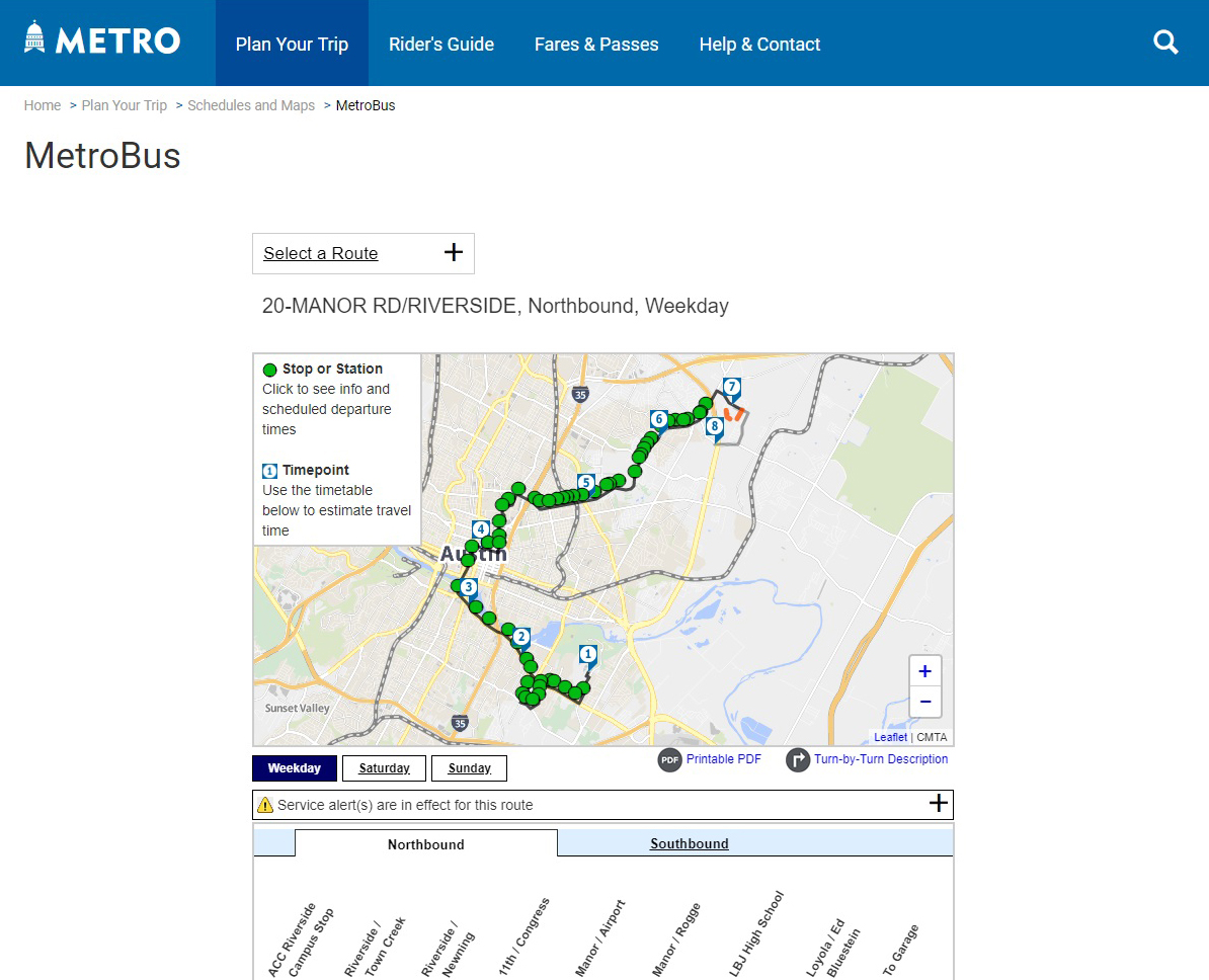
Here's a 2018 screenshot of that UI in action from the staging server. The development team still haven't cleared up that spacing issue yet!
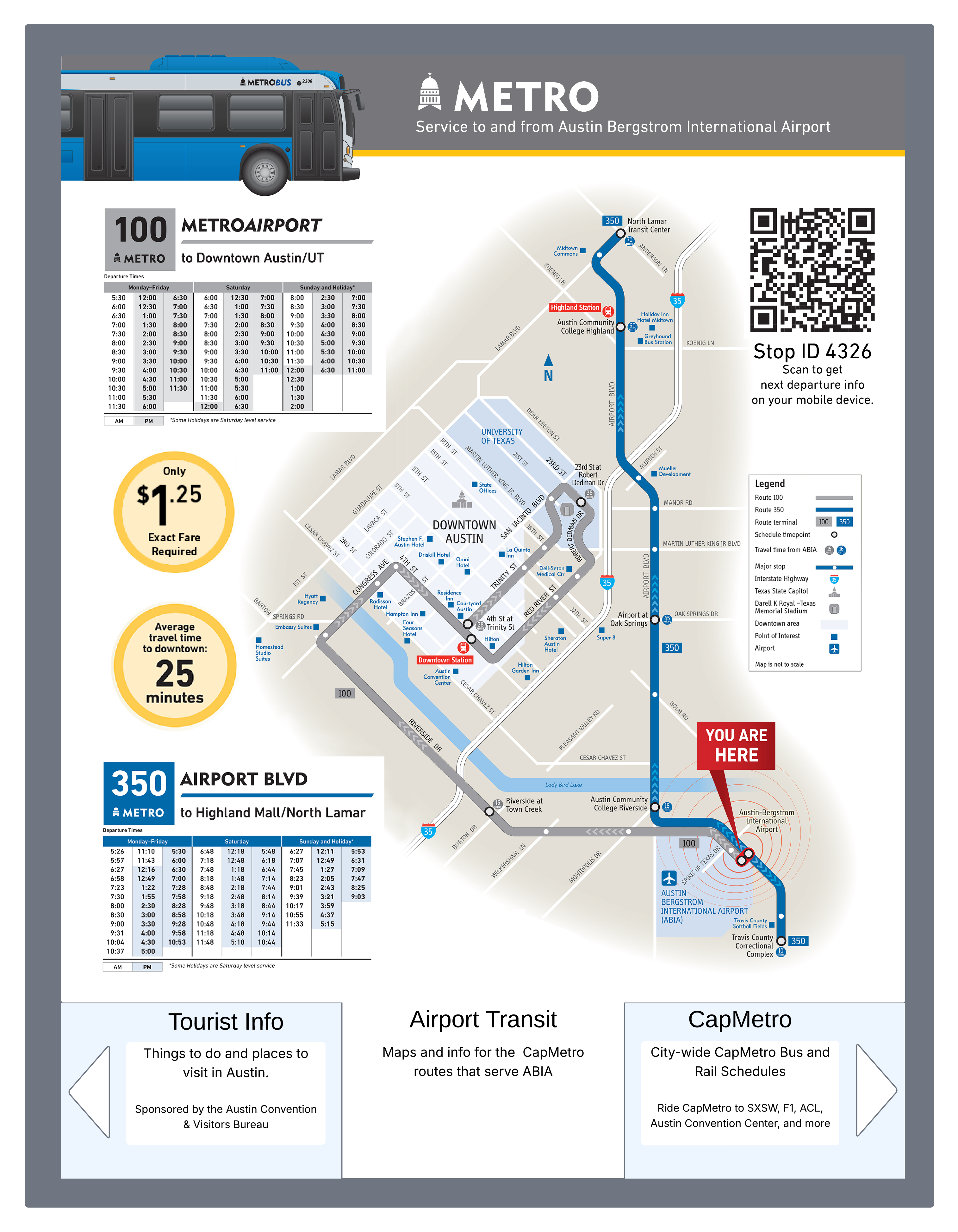
One of the more unique user experiences I got to research and design for CapMetro was the touchscreen info kiosk at Austin Bergstrom International Airport. This was a joint project between the city of Austin and CapMetro, but CapMetro got to take the lead on the interface design. The functionality was very limited by the kiosk itself - it is little more than an interactive poster. However, the user could still get bus route schedules with a simplified webview of the above schedules and maps interface. This kiosk was active at the airport for several years before funding dried up and the kiosk was replaced with a static digital poster. Alas.
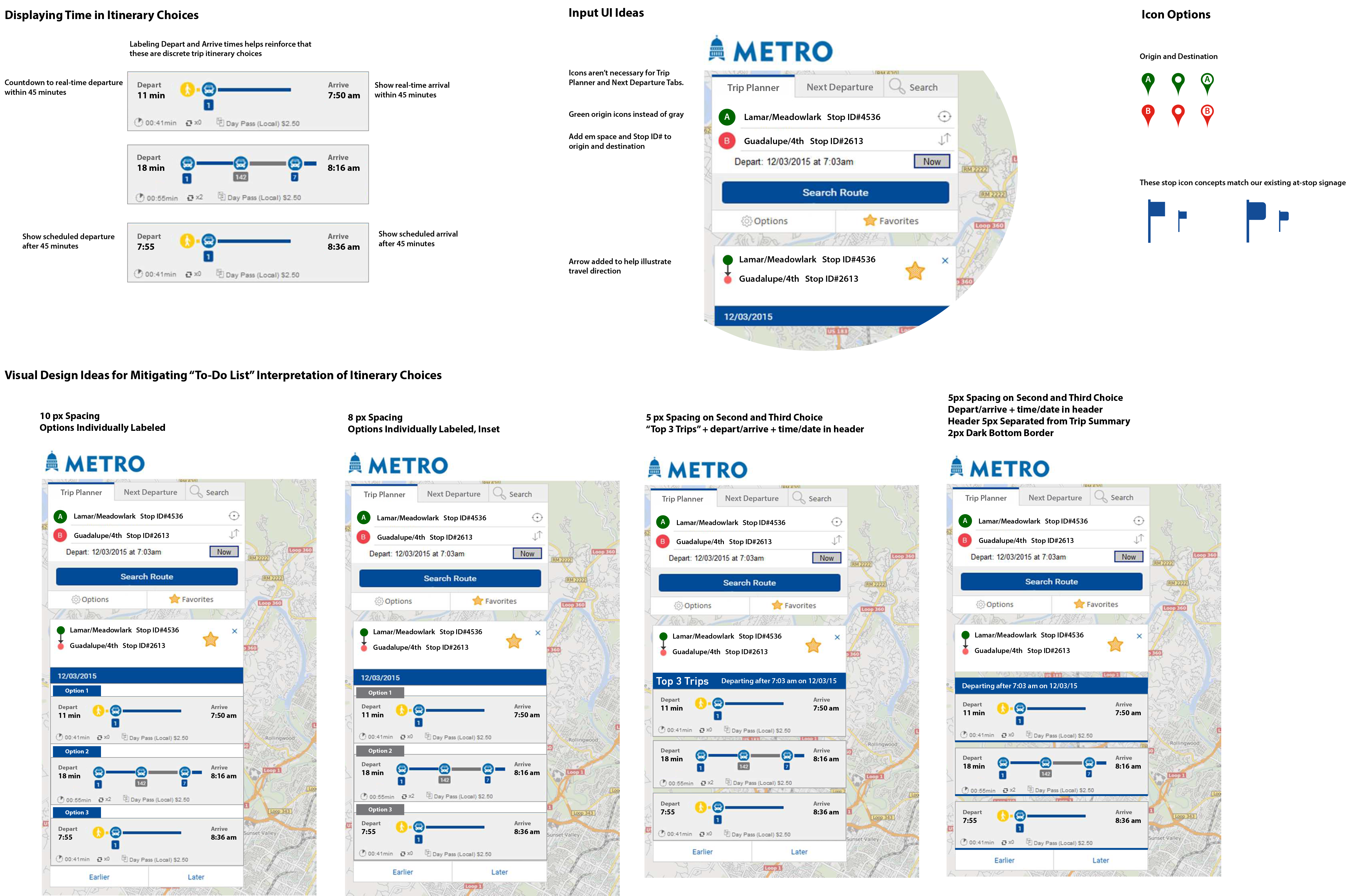
This is an example of fine-tuning the app UI in concert with the CapMetro development team and the app developer. We created a hi-fidelity prototype and tested it with our customer representative board. These UI element options were the results that we presented to the team.
Want to see more?
I'd be happy to discuss this project in more detail. Please feel free to contact me to set up a conversation.
jtucker.uxpro@gmail.com